Hospice Muskoka Brand & Design System
Hospice Muskoka is a nonprofit organization providing physical, mental and emotional support for those diagnosed with a life-threatening illness and their families. Most community members know Hospice Muskoka through contact with their Hospice facility, Andy’s House.
After conversations with the Executive Director and visiting the Hospice facility, I felt their branding wasn’t reflective of the organization’s impressive clinical expertise and warm and inviting atmosphere.
Keeping their existing logo, I developed a fresh new look, implementing it across their marketing materials. I started building out a reference system to make it easier when working across various marketing channels. This is still a work in progress!
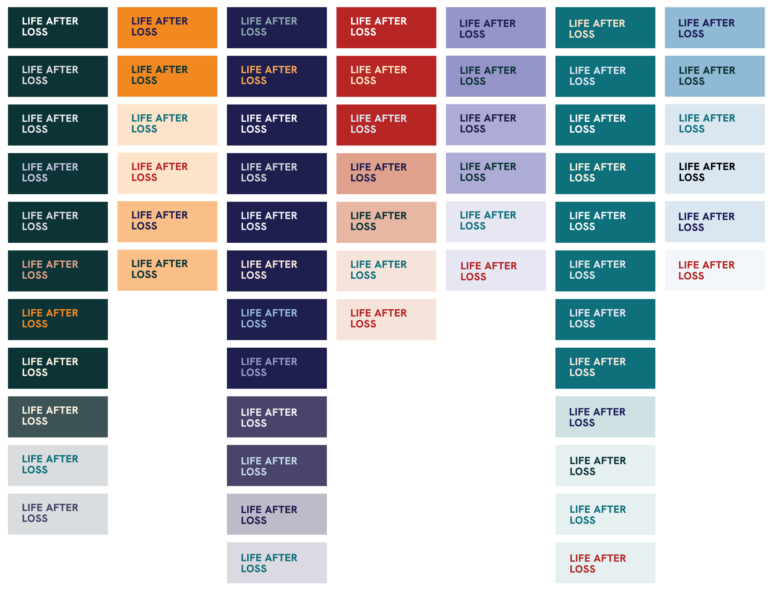
BRAND COLOURS & ACCESSIBLE PALETTE
TYPOGRAPHY
ICONS & PATTERNS
BRANDING IN CONTEXT
WEB ELEMENTS: TYPESCALE, HEADER TEMPLATES AND BUTTON DESIGNS


